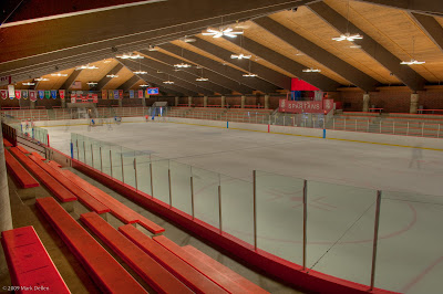
What if we could see it the way the architects must have imagined it? The owner of Hat Trick Hockey told me the main sheet was built in 1971, just about what I guessed earlier. (The other sheet at Richfield was added in 1999.) So here are several photographs of what the rink would look like if it were well lit. There are even some skaters in the photos, although sometimes the architects might choose to render them as outlines...
 The architects would want everyone in Richfield, especially those on the planning committee, to see that it was the home of the Spartans, a place that would make them proud.
 This is the view from the bench that Coach McCoy sees during every game.
 There are doors at each of the four corners of the rink.
 Banners from the schools that use the rink add some color.
 It's a beautiful arena where lots of fans can watch games in comfort.


No comments:
Post a Comment